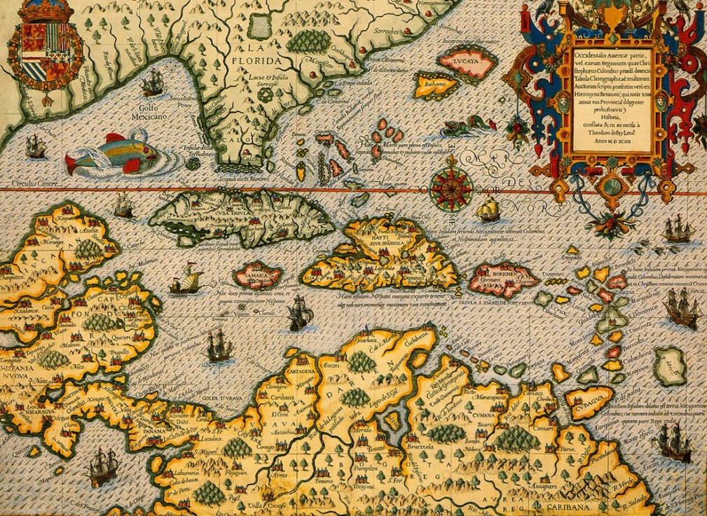
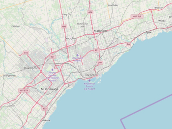
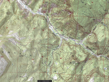
Cartography, the art and science of mapmaking, has a rich history spanning centuries. From ancient maps etched on parchment to modern digital maps rendered on screens, cartographers have employed design principles to create maps that are not only visually appealing but also informative and functional. In this article, we delve into the art of cartography, exploring key design principles that guide the creation of maps and ensure their effectiveness in conveying spatial information.
- Simplicity: Simplicity is a fundamental principle of map design that emphasizes clarity and ease of understanding. A well-designed map should convey information concisely and without unnecessary complexity. Avoid cluttering the map with excessive detail or extraneous elements that may distract from the main message. Use clean lines, simple symbols, and a limited color palette to communicate essential information clearly and effectively.
- Hierarchy: Hierarchy is the arrangement of elements on a map to establish a visual hierarchy of importance and prominence. Important features, such as major roads, landmarks, and boundaries, should be emphasized and given greater visual weight compared to less significant elements. Use size, color, and contrast to distinguish between different features and prioritize the information that is most relevant to the map's purpose and intended audience.
- Legibility: Legibility refers to the ease with which information can be read and understood on a map. To ensure legibility, use clear and legible fonts for labels and text, choosing font sizes that are appropriate for the size of the map and the level of detail being presented. Pay attention to spacing and alignment to avoid overcrowding or overlapping labels, which can make the map difficult to read. Use a consistent labeling style and placement to maintain coherence and clarity throughout the map.
- Balance: Balance is the distribution of visual elements across the map to create a sense of equilibrium and harmony. A well-balanced map should feel visually stable and cohesive, with no single element overpowering the others. Achieve balance by distributing features evenly across the map, avoiding large empty spaces or clusters of information in one area. Use symmetry, asymmetry, and visual weight to create a sense of balance and visual interest.
- Contrast: Contrast is the difference in visual properties, such as color, value, and texture, that make elements stand out from one another. Use contrast to highlight important features and draw attention to key areas of interest on the map. Contrast can be achieved through differences in color intensity, lightness or darkness, and texture or pattern. Ensure sufficient contrast between features to make them easily distinguishable and to enhance readability and visual impact.
- Consistency: Consistency is essential for maintaining coherence and cohesion across the map. Use consistent symbology, labeling conventions, and visual styles throughout the map to create a unified and cohesive design. Ensure that symbols, colors, and fonts are used consistently to represent similar features or categories of information. Consistency helps users understand and interpret the map more easily, reducing confusion and enhancing usability.
Cartography is both an art and a science, requiring a balance of creativity, technical skill, and attention to detail. By applying design principles such as simplicity, hierarchy, legibility, balance, contrast, and consistency, cartographers can create maps that are not only visually appealing but also informative, functional, and easy to understand. Whether creating maps for navigation, education, or visual communication, understanding and applying these design principles is essential for producing maps that effectively convey spatial information and enhance our understanding of the world around us.


